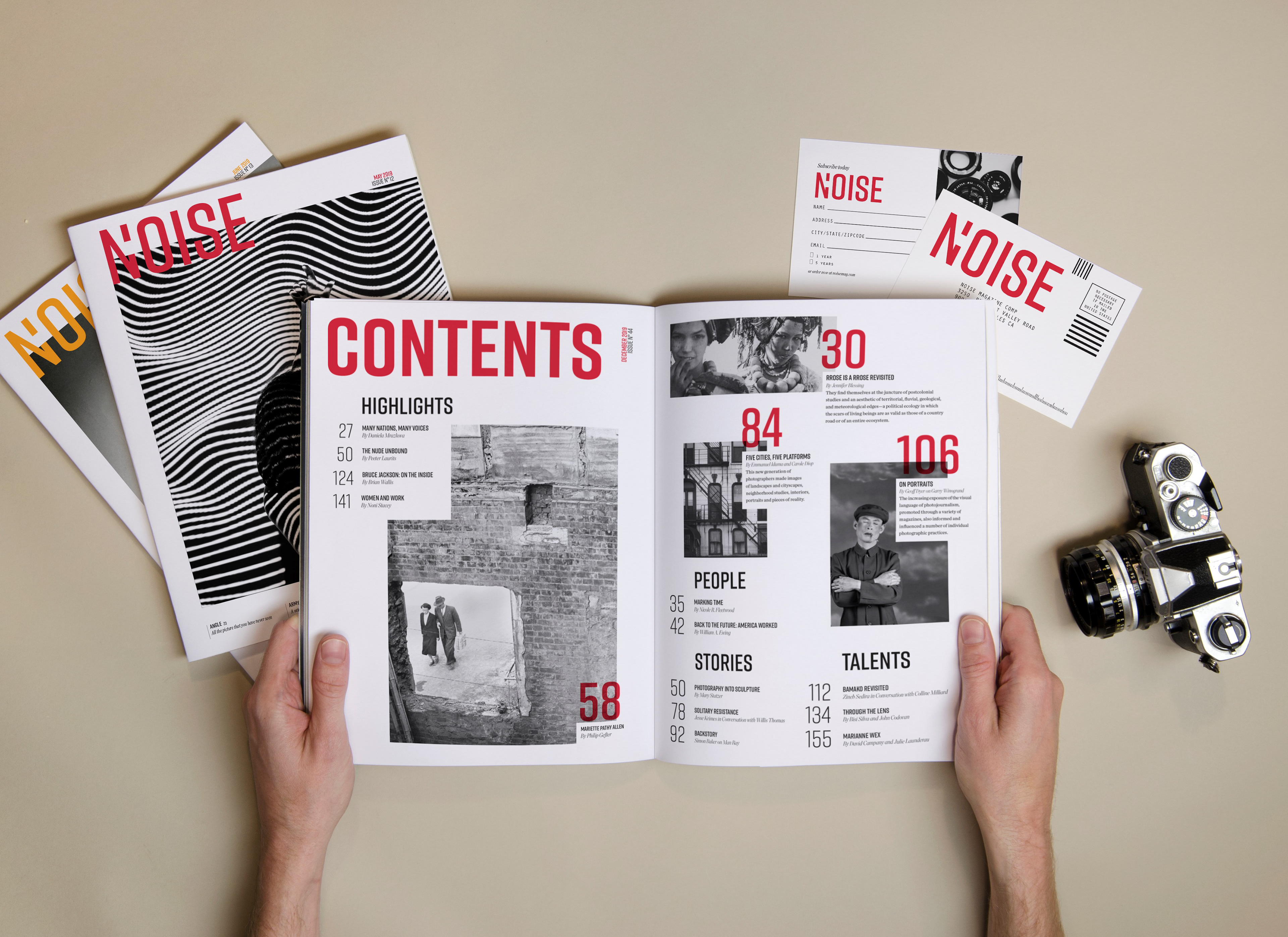
Noise is a contemporary photography publication that showcases both emerging and established photographers from around the globe. Based in London with contributors from all over the world, the magazine focuses on compelling and in-depth interviews, editorials, studio visits and photobook reviews. Targeting professional and amateur photographers between 30 and 45 years old, the magazine showcases work from all genres of photography from documentary to landscape.
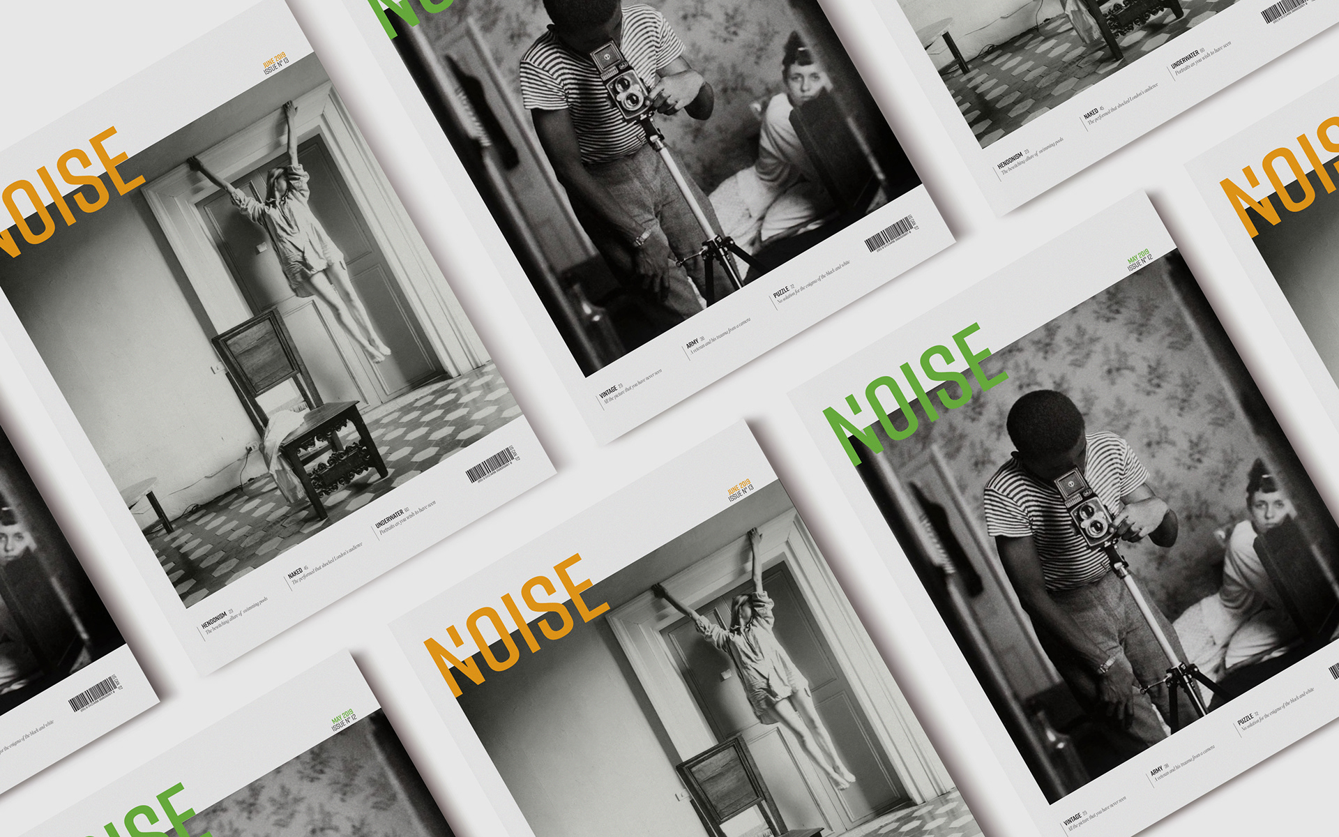
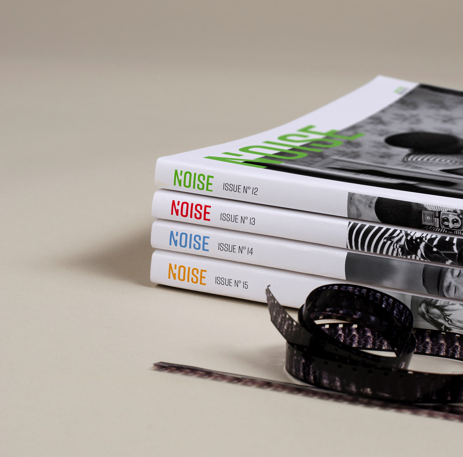

To differentiate from a plethora of competing publications, each issue uses a different vivid spot color that is applied throughout the magazine. This spot color pops over the black and white photos, adding sparkle to the layouts while keeping costs low. Each cover features an intriguing image from the world of modern and vanguard photographers. The magazine’s heavy photography use is highly curated for details and aesthetics. Rift, a condensed geometric square sans serif, brings a playful vibe to headings while remaining earnest. Chronicle Display, a high-contrast transitional typeface, is used for the body copy and it contributes warmth and simplicity to the layout. The 9” x 12” format allows for ample white space to enhance the imagery and bring clarity to the layout hierarchy.