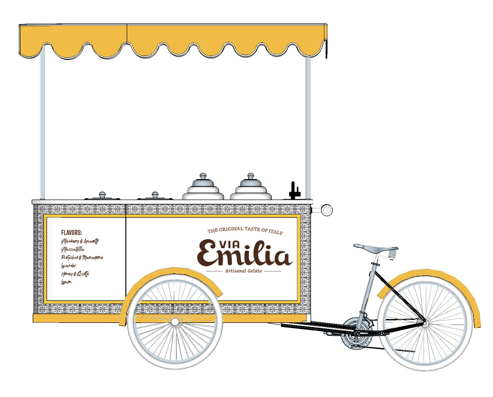
Via Emilia is a family owned, time-honored gelato-company with deep roots in Central Italy. The owners hope to create connections between their native Italy and California as they open a shop in the heart of Old Town, Pasadena. The brand conjures nostalgia fused with modernity, paying tribute to old world techniques and traditions with a fresh, clean approach. The artisanal quality of their products made with choice, local ingredients, target 30-45 year old upper middle class working families and their children, looking to discover the authentic taste of Italy.

A disciplined approach was needed to craft a traditional, yet fresh name for this family owned Pasadena based gelato brand. Fusing authenticity and classic flavors with contemporary tastes required looking both to the past and present. The owners wanted to pay tribute to old Italian logos and typography. Via Emilia was the right choice as a brand name as it has not been commonly used in United States for gelato companies. The word is compelling enough to appeal to a wide audience of Italian speakers for word recognition and charm with its pronunciation to English speakers.

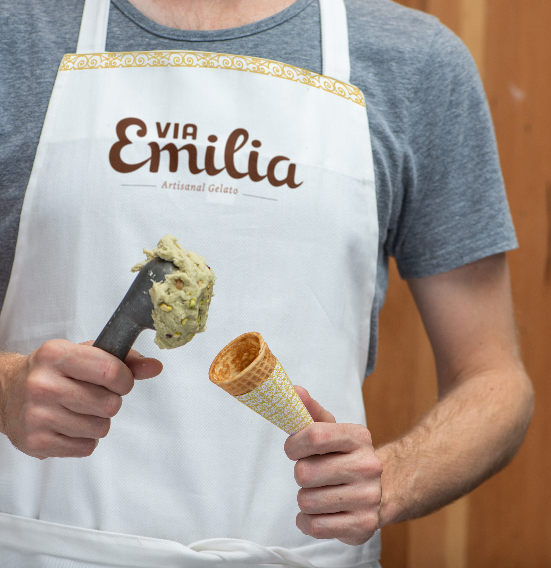
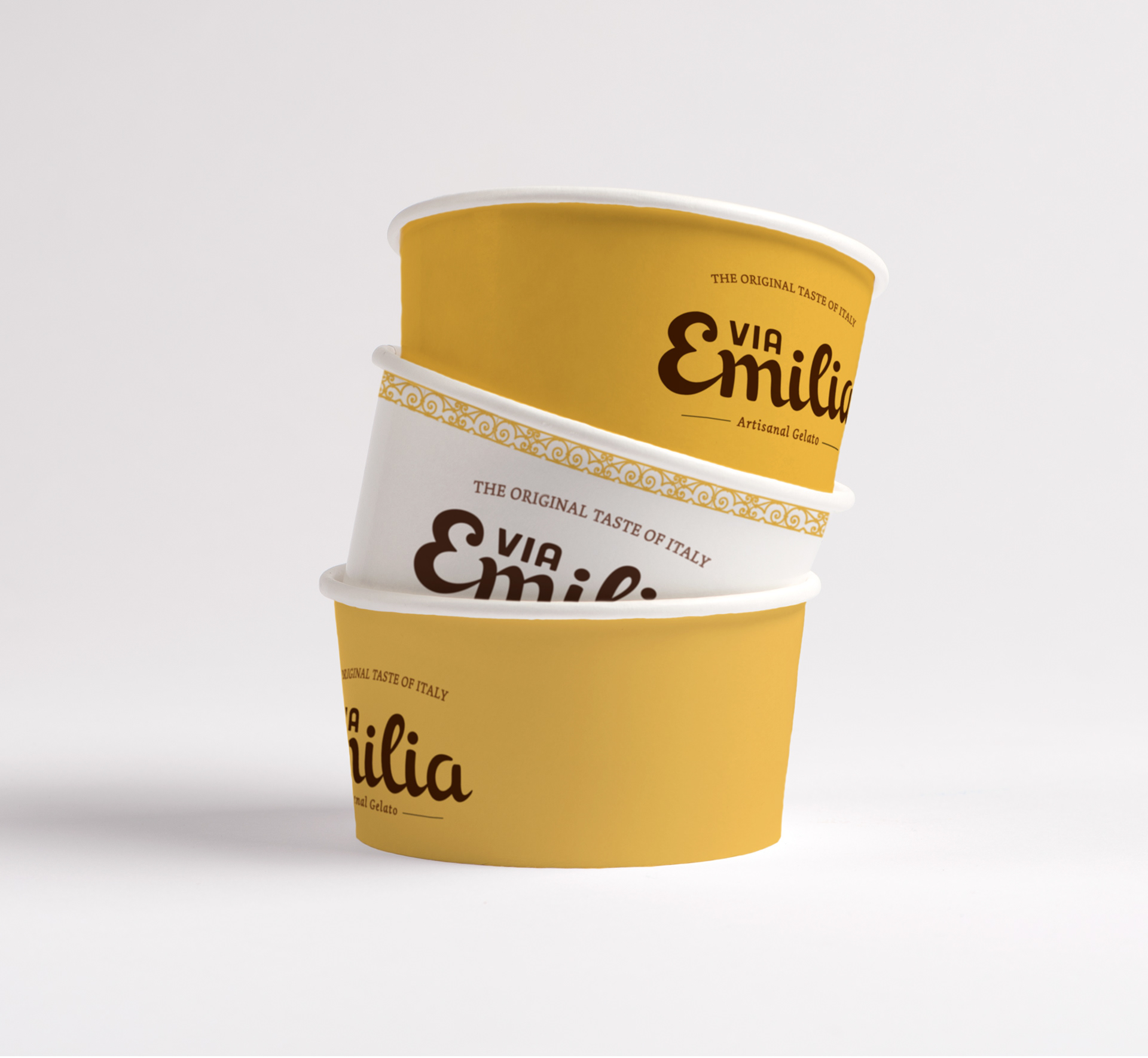
To communicate the traditional spirit of the brand, a custom type was created for the logo. With calligraphic influences, the lettermark is simple to retain it's earnestness with particular attention to crispy details.
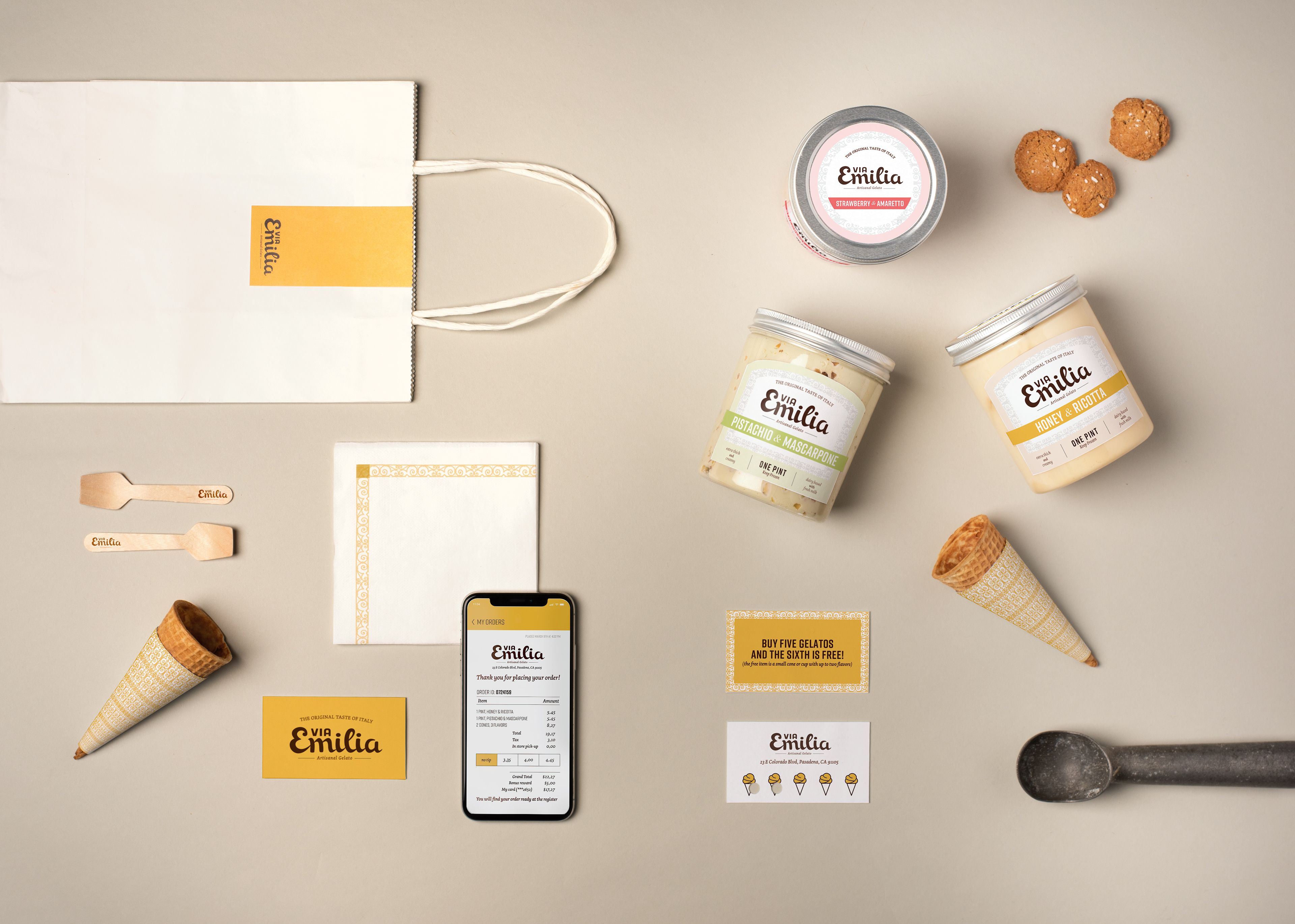
For the label, environmental graphics gelato card and branded items like aprons and cups use a typographic combination of Rift, Dolly, Cubano and Chronicle Deck. This create an elegant contrast to embody the brand attributes with a classical yet playful quality and finish. The shapes and flow of the lettering , as well as the warm color palette are meant to invoke the creaminess of the gelato and patina of old pictures and memories. The simply shaped jar is meant to recall old homemade flavors and showcase the gelato in all it's richness. The silver cap adds a flash of excellence and thoughtfulness to the package.